Customizing Swiftype Visual Styles
The Swiftype JavaScript embed code injects HTML and CSS into your page to present search results and autocomplete.
You can change the appearance of a few things through your Swiftype dashboard, but for more advanced customizations you will need to override the default CSS that the embed includes. To do this, you can write custom styles either within your site template or a global CSS file that target specific elements in your HTML markup.
Note: To change the style of the Swiftype embed, you will need a working knowledge of HTML and CSS. If that seems daunting, you could consult your friendly neighborhood web nerd or check out free resources on the web, like CSS Basics.
Styling the search box
Using your existing search or removing styles
From the installation configuration view in your Swiftype Dashboard, it's possible to define a custom class for your search to attach to. This is beneficial if your site's theme already includes an input field with a custom class, or you'd prefer an unstyled input field.

Default styles
The standard code for installing a Swiftype search box is an input field with the st-default-search-input CSS class.
<input type="text" class="st-default-search-input">

When you use the class st-default-search-input our default styling is automatically applied to the search box. The following CSS examples are based on using the st-default-search-input class.
Adding placeholder text
If you are wanting to add placeholder text to your search box, you can do this with the HTML placeholder attribute. Just add the paceholder attribute to your search input field, like this:
<input type="text" class="st-default-search-input" placeholder="Search this site...">

Changing the size of your search box
You can easily change the size of your search box. Add CSS styling directly (inline) to the input code snippet.
Here's an example of an input field with both a width and height value specified:
<input type="text" class="st-default-search-input" style="width: 300px; height: 50px;">

Adding a submit button to your search box
Who doesn't like buttons? To add a submit button to your search input, you can wrap the input code in a form container element and add a button element. All styling of the submit button is up to you! You can find an example below.
<form>
  <input type="text" class="st-default-search-input">
  <button type="submit">Submit</button>
</form>

Styling your results
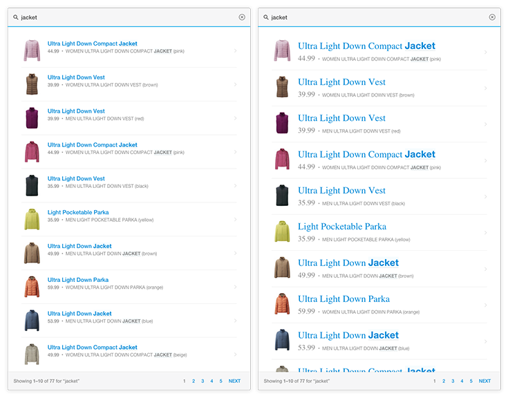
In this basic example, we're going to target the .st-ui-type-heading & .st-ui-type-detail classes to change the font and size of the text displayed:
.st-ui-type-heading, .st-ui-type-detail {
  font-size: 15px !important;
    font-family: Times, serif !important;
}
In the renderings below, the images on the left are examples of an autocomplete dropdown and full result listing with our default CSS styling. The images on the right have our custom style applied.
Autocomplete Results

Full Search Results

Fully custom CSS stying (advanced)
If you would like to take total control of the CSS styling and you are comfortable with customizing and writing your own code, you can use the Swiftype jQuery autocomplete and search plugins to fully design your search experience.